Obscure Error Messaging
This article was last edited over 3 years ago. Information here may no longer be accurate. Please proceed with caution, and feel free to contact me.
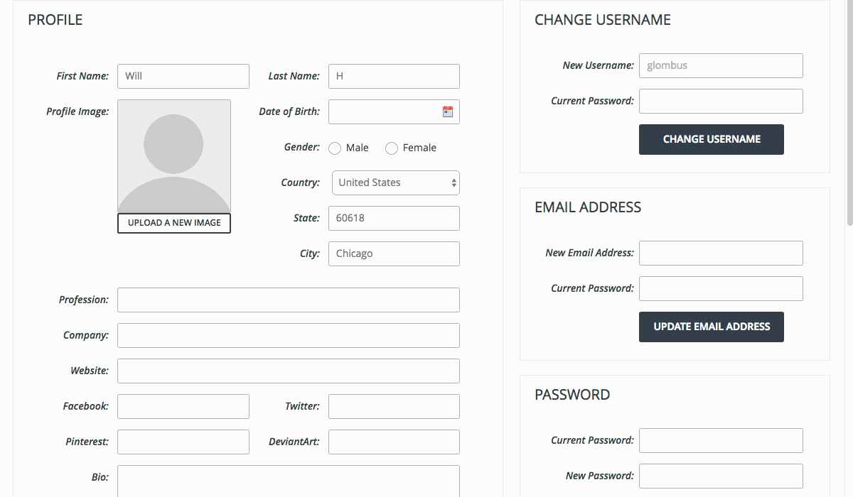
Notice what happens here when changing a setting. A confirmation message is displayed at the top of the page. The message is essentially useless in this case unless the user happens to scroll up. You can see the page shifts to accomodate the message, but when scrolled towards the bottom of the page, it is not clear to the user why it happened.
When editing the bio, an error message is displayed because an ancillary required field is invalid. Again, the message is not visible, so it is not clear if the action succeeded or failed.
I do not have any great suggestions for improvement. Scrolling the user up automatically seems jarring. Perhaps displaying confirmation and error messages near the modified setting would be more helpful?